I
've written about transparency before, but "the bleak midwinter" seems like a good time for a mini tutorial on one of most dazzling effects you can create with color. It's magic . . . and very doable!
You need to understand two concepts for successful transparencies:
* Value (the lightness or darkness of color)
* Intensity (how brilliant or muted color is, such as neon blue versus slate blue)
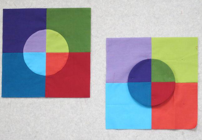
There are also two
kinds of transparency, parent/child and layered.
In parent/child transparency, two see-through colors overlap, creating a new color. Think of a light parent, a dark parent, and a medium child. At the same time, the colors must be a consistent intensity; that is, the same degree of brilliance. I like to say, "Two dull parents cannot make a bright child." (Sorry, that's
so judgmental. :-)
Ready? Let's look!
Tip: A great way to experiment with transparency is to use a nine-patch format, in a 9-inch mock-block. The pieces are large enough to audition your fabrics, without wasting fabric.
In this example, there are three values, light, medium, and dark. The color wheel is also at work: a light yellow parent, a dark teal parent, and a medium green child.
For this block I started with the child and then looked for the logical parents. Notice that the bit of bluish-gray in the light parent shows up in the child.
The first of these two blocks was a no-brainer because the center fabric (the child) and the blue parent are from the same designer, Kaffe Fassett. It's a cheap thrill when that happens.
Value, color, and design are at play in the next two blocks. See how the design lines seem to flow vertically, from the light parent through the child. Success really depends on having or finding just-right fabrics!
The above block works well because the yellow-orange and the orange-green batiks are both by Hoffman.
Layered transparency is just like it sounds; a "layer" of color floating above or below another layer. Again, the values must be different, but the intensities similar. These two mock-blocks were warm-ups for my Transparent Squares quilt.
Notice that the "lights" in these mock-blocks range from very light to more medium, giving the centers definition.
Bright solids work well, too.
Sandra Bruce and Kari Hannickel in front of Kari's Transparent Circles quilt. (Sandra did the quilting.) Don't the circles float beautifully? And wow, that ombré sashing!
A behind-the-scenes look at my Pop Beads quilt. I pieced the squares first, then cut the circles from them. The small swatches indicate the white-and-black fabrics for the backgrounds.
Another look at the finished quilt.
This intriguing quilt was made by Anne Itto, who said that many of her fabrics were collected on trips to Japan.
This block is especially convincing as a transparency:
I took the design for this mock-block from a cropped portion of my Transparent Squares quilt, then added a few new pieces, including a large-scale plaid.
I duplicated the photo of the unit four times and created three different layouts. The first one reminds me of Attic Windows.
The second layout doesn't work; the dark green squares in the center make for a boring focal point.
But wow, look at the four units rotated so the light areas are inward. This design is
very
transparent and floaty to my eye.
A
las, I have more examples, but I'll save them for another time. The sun is shining, and that means it's time for a brisk walk.