banner 4 11/12

Christine's Color Connection

A newsletter for quilters in love with color

April 2017       


Find me on Facebook

Join My Mailing List!    


Find me on Pinterest  


cover, small, june

The Quilter's Color Club has lots of info on every aspect of color. You can find my book on my website  
    
New-Neutral Color
I came up with this term to describe colors that are so low-intensity that they function as neutrals among other colors. At a knitting retreat recently, I spotted this pale lichen, with just a hint of bluish and greenish color. Lovely! To see new-neutral color in my latest quilt, read on. . . .
    
My "Antique Modern" Quilt  
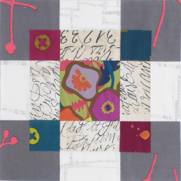
The block below (you saw a smaller version in my last newsletter) is named Antique Modern Block, which seems like an oxymoron, but oh well! I love the design for its different shapes (squares and rectangles) in different sizes. It also offers the opportunity to create a definite foreground and background by consciously working with value (the lightness or darkness of color).

It began with the low-intensity, neutralized colors of the Alison Glass print in the center. From there I added four batiks, also by Alison, and a neutral script fabric. The gray fabric with "pepto-pink" accents gave it an element of surprise, and the subtle gray-on-cream fabric at the edges was perfect as background. So much fun to work with color and pattern in this simple block!


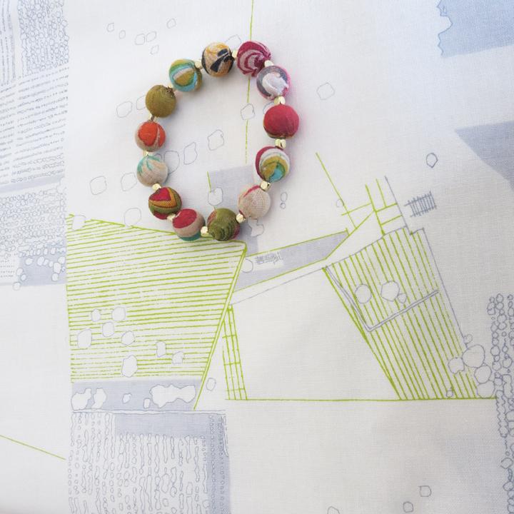
On a field trip to San Francisco a few months ago, I stumbled across this amazing "Aerial" print by Carolyn Freidlander. Perfect, I thought, and bought two yards for good measure. The bracelet, which I got that day at the deYoung Museum, is in the photo for scale.


I also wanted setting squares for another element, and I had the perfect gray-and-cream dot by Denyse Schmidt.  

The finished quilt top, with the pattern to come in time for the retreat. (My Artistic Alchemy workshop is full, but email me if you'd like to be on the waiting list.)

Do you see the illusion of transparency with the batik squares and gray fabric? I give myself extra credit. :-)


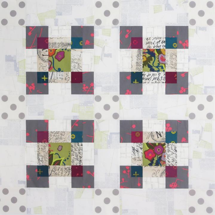
The subtle patterns in the light-value fabrics did just what I'd hoped for, making the blocks advance. The gray dots add another ingredient to the mix, but they don't take over. Once gain, "the fabric makes the quilt!"

Low-volume Fabrics, continued 
If you follow our Artistic Alchemy blog, you may recall the examples of low-volume fabrics in my most recent post. The term "low-volume" refers to light-value fabrics that often function as background in a block or quilt. Many are white-with-black, while others are colored. Here are a few examples, starting with my all-time favorite:

Another favorite, with a casual geometric design.


Gray is a popular low-volume fabric, and when it has a subtle pattern, it shimmers.
 
Script fabrics make ideal low-volume backgrounds.
 
The words need not be legible.


If these lines were any closer, the fabric might read as gray from a distance. It helps to stand back when considering low-volume fabrics.

Light-and-airy prints with color still read as low-volume when there is lots of negative space.
 
Just for fun, my latest "Gypsy Wife" block in Kaffe Fassett fabrics and three gray-and-white prints. It's definitely another potato-chip block: you can't stop at one.

Thanks so much for looking. I hope you'll start looking for low-volume fabrics and new-neutral colors to go in your next quilt!   

About This Newsletter   

If you've received this newsletter, you may have attended one of my workshops or bought one of my books, patterns, or color wheels. It's easy to opt out, below, but I hope you'll stick around to see what's in store. It's all about color, using it, enjoying it, and sharing it with other quilters.


Thank you! 

Contact Info

Christine Barnes

[email protected]
www.christinebarnes.com