TTS logo v.1
ALL THINGS TYPOGRAPHIC   |   APRIL 2017
  
>>
Understanding and Applying Small Caps

>>
Anisette, the Typeface with Three Sets of Caps

>>
How Fonts Influence Perception of Your Product

>>
Creating the Most Important Brand: Yours

>>
2017's Biggest Logo Design Trend (so far)

>> Type Rules! 4th edition
Understanding and Applying Small Caps 
Small caps are capital letterforms that usually approximate the height of the lowercase, and for some fonts, can be taller. In spite of their usefulness, small caps are a frequently overlooked as well as a misused feature of typesetting. While many designers are aware of small caps and apply them to their work, they often don't know the difference between true-drawn small caps and the fake, computer-generated variety that are considered a type crime.   Read on...
Anisette, the Typeface with Three Sets of Caps
Anisette, designed by Jean François Porchez of Typofonderie in France, is not a brand new typeface, but one that recently caught my attention from a "snail" mailing, and totally wowed me. Anisette is a geometric sans influenced by the 30s and the Art Deco movement, and is available in nine upright weights - from thin to black.   Read on...
How Fonts Influence Perception of Your Product
Graphic designers have always used typography to visually connote written language, conveying aspects like mood, personality and age. Many experiments have shown how different typefaces can make a message more or less trustworthy and appealing to readers. One of these experiments was conducted in 2013 by filmmaker and author Errol Morris and the New York Times. The results were thought-provoking.  Read on...
Creating the Most Important Brand: Yours

How's your brand? Not that project you're working on for a client. Your brand. Is it unique? Memorable? Have you spent as much time crafting it as you would a client project? And what about the words you use to support it? Could those perhaps use a bit of work? Robin Landa, educator and author of Build Your Own Brand, offers her take on designing an effective personal brand.   Read on...
2017's Biggest Logo Design Trend (so far) 

So what is 2017's biggest logo design trend so far? It's what we're going to call "wordmark uppercasification". Agencies are hitting the caps lock button in order to add emphasis and gravitas to the client's logotype in the first quarter of 2017. This could end up being a bit SHOUTY, but the application of an agreeable typeface does the job of softening the aggression that uppercase usage can impart.  Read on...
Type Rules! The designer's guide to professional typography,
4th edition

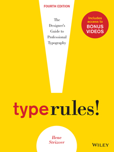
Type Rules! The designer's guide to professional typography, 4th edition is a practical guide to the principles and practices of typography. From the fundamentals to cutting-edge applications, this edition has everything today's serious designer needs to use   type effectively. 

Type Rules! includes topics such as how to select the appropriate type for the job, setting type like a pro, how to avoid common mistakes, how to design a typeface, as well as how to fully harness the typographic power of InDesign, with new coverage of their latest version. It also includes dozens of exercises to reinforce the understanding and application of the contents. Details and reviews here...

" I've purchased and read just about every book on typography written over the last 25 years. Ilene Strizver's Type Rules! is one of the best. It's a book that will prove its value time and time again."
- Allan Haley, Director of Words and Letters, Monotype Imaging

"Type Rules! is a must-have book for students and professionals alike. I highly recommend it."
- Prof. Ed Benguiat, world-renowned type designer and educator

FREE COPIES FOR EDUCATORS: Evaluation copies are provided free to qualified academics and professionals for review purposes.  Details here...
CHECK OUT OUR  ARCHIVE  OF PAST EDITIONS. 
YOU JUST MIGHT FIND THE INFORMATION YOU WANT...OR NEED!
Follow me!

Like us on Facebook
   Follow us on Twitter   View our profile on LinkedIn
NOTE:  In opposition to my constant typographic badgering, you might notice the lack of
smart typographic conventions in this emailing, including smart quotes, en and em dashes. This is due to the limitations of the email marketing service currently being used.