MARK ROTHKO: Dark Palette - an incredible show at the Pace Gallery in NYC until 7 January
In the interest of full disclosure, I must first say that Nancy and I
loveRothko's work; but, having said that, I feel that this is a
must-see show! It is
only up until 7 January, so don't wait too long.
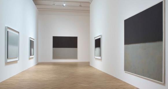
The show displays many of
Rothko's works--and many of the ones it has on display are true masterpieces. I include only a few here as a teaser. And any photograph of a
Rothko painting can
only be a teaser (or, at best, a reminder, if you know the actual painting well in person, too). To appreciate these works, you must see them in person.
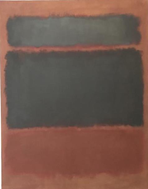
Black in Deep Red. 1957. Oil on Canvas
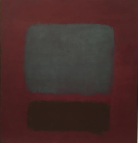
No. 37 / No. 19 (Slate Blue and Brown on Plum). 1959. Oil on Canvas.
.
.
And the following, one of the murals originally intended for the Four Seasons Restaurant in the Seagram Building in NY, is on loan from the private collection of
Rothko's children (there are six others, even more fabulous paintings from this series, at the Tate Modern in London):
One of the "Seagram murals." 1959. from the private collection of Kate Rothko Prizel & Christopher Rothko.
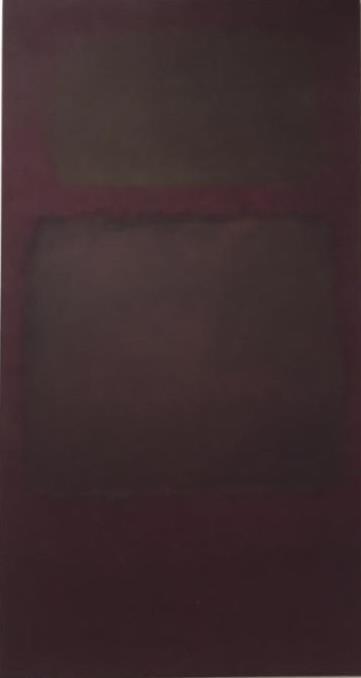
Untitled.
(Dark Gray on Maroon). !963. Oil, acrylic, and mixed media on canvas.
.
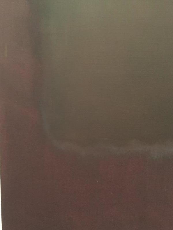
The detail below (from the work above) gives a sense of the amazing complexity of
Rothko's surfaces and edges. One can stare endlessly into almost any small area of one of his paintings and find a richness and subtlety that is totally entrancing. Not only are his overall compositions things of beauty, not only are the forms and backgrounds upon which they hover and with which they interact in an intense tension and immobilized implicit motion, not only are the color combinations and contrasts powerful statements on their macro level as well as on the micro level (never miss the subtle but striking small areas of color he introduces at key moments)--the actual surface texture of his application of the paint is a wondrously painterly feast for the eyes of those willing to observe them:
.
The following wonderful work, one of several in which
Rothko worked in acrylic on paper, in this case mounted on a panel, does, indeed have a somber palette. Nevertheless, it remains every bit as full of life and creative vitality as his work in lighter palettes.
Untitled. 1968. Acrylic on paper mounted on panel.
My biggest quibble is with the show's title, and the premise taken by some (especially
Hilarie M. Sheets in the NY Times of 2
behind it. There is the claim that the severity of
Rothko's depression led to the darkening of his palette. I do not feel that there is anything but
life and vitality expressed in the paintings in this show (with the possible exception of a couple of less good work that just generally lack the energy and creative depth of his better pieces). In fact, the painting from 1969 until his suicide in February 1970
do seem to reflect an extremely depressive shift in his work, moving into rather lifeless blacks and grays. Nevertheless, these are
not the paintings exhibited in
MARK ROTHKO: Dark Palette;
none of those paintings are part of this show! Below is a photograph from the
2012 exhibit of these works at the
Pace Gallery in London ("
Rothko/Sugimoto: Dark Paintings and Seascapes," which Nancy and I saw, and which did feel depressed in a way enormously unlike the ones in this current exhibition):
The Pace Gallery is honored to present Rothko: Dark Palette, an exhibition tracing the history of Mark Rothko's use of dark colors in his sectional paintings. It will be on view at 510 West 25th Street from November 4, 2016 through January 7, 2017
.
The exhibition reveals the development of Rothko's expressive use of color from 1955 through the 1960s. Presented in association with the Rothko family, Dark Palette will feature loans from museum collections including the Albright-Knox Art Gallery, Buffalo; The Museum of Modern Art, New York; The National Gallery of Art, Washington, D.C.; and Virginia Museum of Fine Arts, Richmond, and will be accompanied by a hardcover book with writings by Mark Rothko, his son Christopher, and an introduction by Arne Glimcher.
New York-The Pace Gallery is honored to present Rothko: Dark Palette, an exhibition tracing the history of Mark Rothko's use of dark colors in his sectional paintings. It will be on view at 510 West 25th Street from November 4, 2016 through January 7, 2017. The exhibition reveals the development of Rothko's expressive use of color from 1955 through the 1960s. Presented in association with the Rothko family, Dark Palette will feature loans from museum collections including the Albright-Knox Art Gallery, Buffalo; The Museum of Modern Art, New York; The National Gallery of Art, Washington, D.C.; and Virginia Museum of Fine Arts, Richmond, and will be accompanied by a hardcover book with writings by Mark Rothko, his son Christopher, and an introduction by Arne Glimcher.
In a landmark untitled painting from 1955, which has never been shown in the United States, Rothko begins his journey into the dark palette that will dominate his later years. Such milestones include the Seagram Murals and Rothko Chapel commissions. Dark Palette will include one of the paintings from the Seagram Mural series.
"On several occasions, Mark spoke of the importance of tragedy and tragic themes as stimuli for the creation of profound beauty. Rothko considered tragedy a theme worthy of art. He cited Greek theater and the way in which it dealt with the depth of human emotions and universal truths. Although the colors, composition, and levels of intensity change, heroic themes permeate his paintings," Arne Glimcher recounts. The exhibition will reveal these variations through Rothko's dark-value works, expressing this underlying theme. Throughout the artist's career, the act of painting was a "positive, exultant experience for him. His life's work was the expression of pure emotion and color was his medium."
Mark Rothko (b. 1903, Dvinsk, Russia; d. 1970, New York) is widely considered one of the most important artists of the twentieth century. The enduring legacy of his artistic achievement has been recognized through numerous major surveys and retrospectives, most recently at The Museum of Fine Arts, Houston (2015). Other significant exhibitions have been organized by the National Gallery of Art, Washington, D.C. (1998), traveling to the Whitney Museum of American Art, New York, and the Musée d'Art Moderne de la Ville de Paris; the Kawamura Memorial Art Museum, Japan, traveling to three museums in Japan (1995); and Tate Gallery, London, traveling to Museum Ludwig, Cologne (1987). In 1979, the Solomon R. Guggenheim Museum, New York, presented 1930-1970: A Retrospective, which traveled to Museum of Fine Arts, Houston; Walker Art Center, Minneapolis; and Los Angeles County Museum of Art (1979). Paintings 1945-1960 was organized by The Museum of Modern Art, New York, in 1961, with additional venues in London, Amsterdam, Basel, Rome and Paris.
This is the tenth solo exhibition of Rothko's work at the gallery. The artist's work has been represented by Pace since 1978.
--
"A word is not a crystal, transparent and unchanged, it is the skin of a living thought and may vary greatly in color and content according to the circumstances and the time in which it is used."