ALL THINGS TYPOGRAPHIC
|
SEPTEMBER 2016
|
|

>>
Timesaving Tips for Designing with Type
>>
Typesetting Diagonal Fractions
>>
The Typographic Desk Reference, 2nd Ed.
>>
Print Is Not Dead, Says Science
>>
Vintage Typography in Classic Automobile Logos
>> Type Rules! The designer's guide to professional typography
|
|
| |
Timesaving Tips for Designing with Type
There is never enough time when working on a design project. Even your best efforts to complete a job before the deadline can result in late nights and rushed presentations. This is especially true when a project includes type. For this reason, I complied a group of tips and shortcuts that can help make the job of designing with and setting type faster and easier.
Part 1
and
Part 2
|
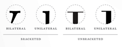
Typesetting Diagonal Fractions
Fractions are an essential element in typesetting. Diagonal fractions are the most commonly-used fraction style in typeset copy. When they are called for, the challenge lies in knowing which diagonal fractions are available in any given font, and how to access or create them. Here's some tips and general rules for typesetting diagonal fonts.
Read on...
|
The Typographic Desk Reference, 2nd edition
Attention type lovers, users, and geeks! It is rare that I write about or endorse books in this column, but this one is worth the exception. The Typographic Desk Reference (TDR for short), 2nd edition, by Theodore Rosendorf, is an encyclopedic reference guide of typographic terms and classifications whose primary focus is Latin-based writing systems.
Read on...
|

Print Is Not Dead, Says Science
After weathering predictions of its demise for almost a decade, the print book is alive and well: According to a Pew Research Center survey, print is still the most popular way to read books. Yes, people increasingly read on smartphones and tablets. But Americans are still twice as likely to pick up a print book as they are to read an e-book.
Read on...
|
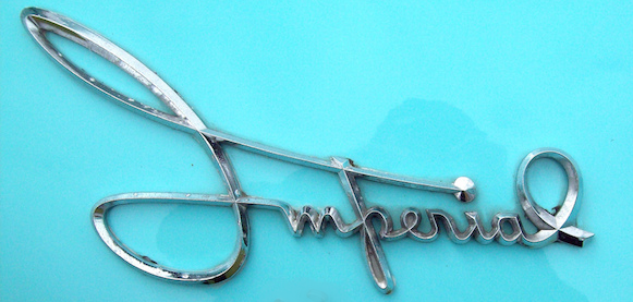
Vintage Typography in Classic Automobile Logos
Say what you will about contemporary cars, but there's nothing like the feeling you get from the old classic beauties. It's a feeling that starts with the lettering of their logos. Because they were custom-designed for each car, each of these typographic logos cleverly embodies some aspect of the car itself.
Check it out...
|
|
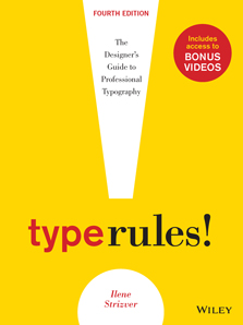
Type Rules! The designer's guide to professional typography, 4th edition
Type Rules! The designer's guide to professional typography
, 4th edition is a practical guide to the principles and practices of typography. From the fundamentals to cutting-edge applications, this edition has everything today's serious designer needs to use type effectively.
Type Rules! includes topics such as how to select the appropriate type for the job, setting type like a pro, how to avoid common mistakes, how to design a typeface, as well as how to fully harness the typographic power of InDesign, with new coverage of their latest version. It also includes dozens of exercises to reinforce the understanding and application of the contents.
Details and reviews here...
"I've purchased and read just about every book on typography written over the last 25 years. Ilene Strizver's
Type Rules!
is one of the best. It's a book that will prove its value time and time again."
- Allan Haley, Director of Words and Letters, Monotype Imaging
"Type Rules!
is a must-have book for students and professionals alike. I highly recommend it."
- Prof. Ed Benguiat, world-renowned type designer and educator
FREE COPIES FOR EDUCATORS: Evaluation copies are provided free to qualified academics and professionals for review purposes.
Details here...
|
CHECK OUT OUR
ARCHIVE
OF PAST EDITIONS.
YOU JUST MIGHT FIND THE INFORMATION YOU WANT...OR NEED!
|
NOTE:
In opposition to my constant typographic badgering, you might notice the lack of
smart typographic conventions in this emailing, including smart quotes, en and em dashes. This is due to the limitations of the email marketing service currently being used.
|
|
|
| |
|

